



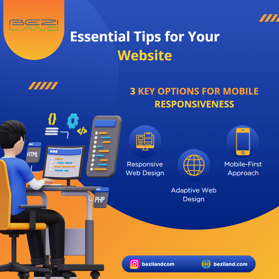
3 Key Options for Mobile Responsiveness: Essential Tips for Your Website
In today’s digital age, mobile responsiveness is a must for any website. With the majority of users accessing websites from their smartphones, ensuring your site is optimized for mobile is critical. At Beziland.com, a leading SEO and web design service provider in Toronto, we specialize in making your website not only visually appealing but also fully responsive across all devices. Here are the three key options to consider for mobile responsiveness:
1. Responsive Web Design
Responsive Web Design (RWD) ensures that your website automatically adjusts its layout based on the device’s screen size. This approach uses fluid grids and flexible images, allowing your website to deliver a consistent user experience on any device—whether it’s a desktop, tablet, or smartphone. Beziland.com uses the latest RWD techniques to make sure your website looks perfect everywhere.
2. Adaptive Web Design
Adaptive Web Design involves creating multiple versions of your site, each tailored to different screen sizes. Unlike RWD, which is fluid, adaptive design is more precise, offering tailored user experiences. Our team at Beziland.com ensures that each version of your website is optimized for performance and aesthetics, catering to various device-specific needs.
3. Mobile-First Approach
A Mobile-First Approach prioritizes the design and development of your website for mobile devices before scaling up for desktops. This method guarantees that mobile users have the best possible experience. At Beziland.com, we implement a mobile-first strategy that helps you stay ahead in a mobile-dominated world, ensuring faster load times and improved SEO rankings.
Partner with Beziland.com to create a website that is not only visually stunning but also optimized for mobile responsiveness, enhancing your SEO performance and user satisfaction. Contact us today to discuss how we can help elevate your website to the next level.